I've spent more hours looking at bunk beds than I probably should admit:)
After looking at many many options, what’s below is an idea for my ideal plan.
To start with, here's a photo of a 'bunk loft' I saw in another house in Tahoe... this is the inspiration for most of what I'm looking for.

In Kaia’s bedroom, I’m imagining a twin loft bed perpendicular above a queen bed. It’s a really tall ceiling, so this should be able to be seven or eight feet high. It can serve as an extra bed, but also a fort/den for Kaia.
the bunk would be fixed to the wall, with only the ladder (ideally black metal) connecting it to the ground.

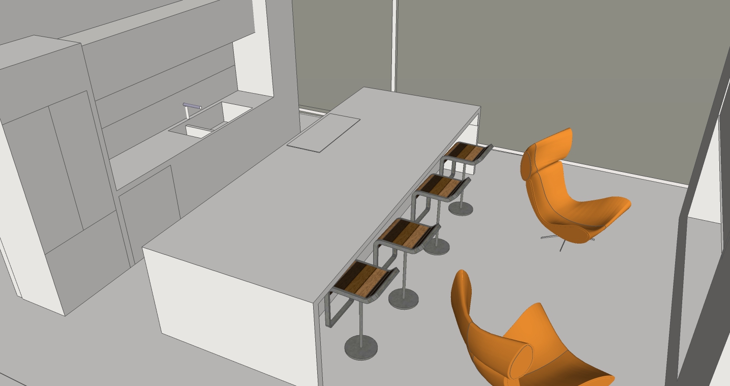
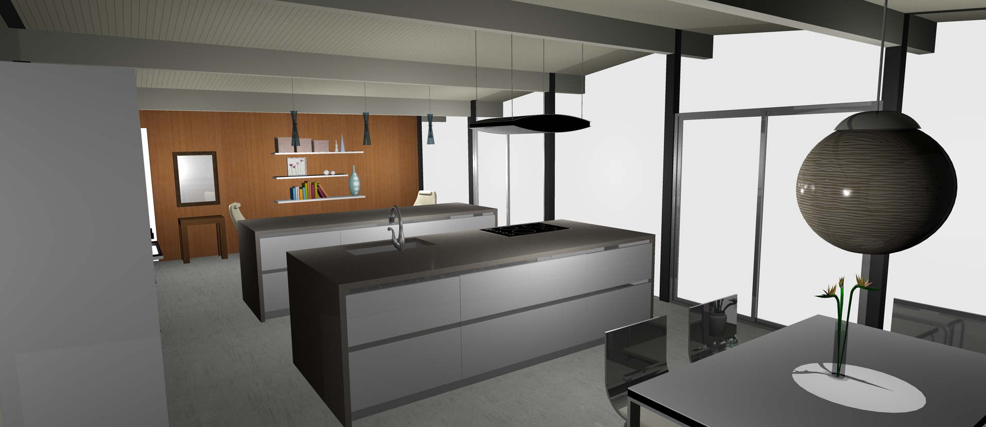
Downstairs, in the games room, I put a bunk loft across the entire length of one wall. Here, I've drawn everything out in 3D, to scale, on top of to scale floor plans.

On a 9' 6" ceiling, I think you can have that bunk loft at say 6' 8" high from ground, and have ~30" head clearance (accounting for depth of the material). Steel or wood ladders on each side (there’d be two twin mattresses up there)
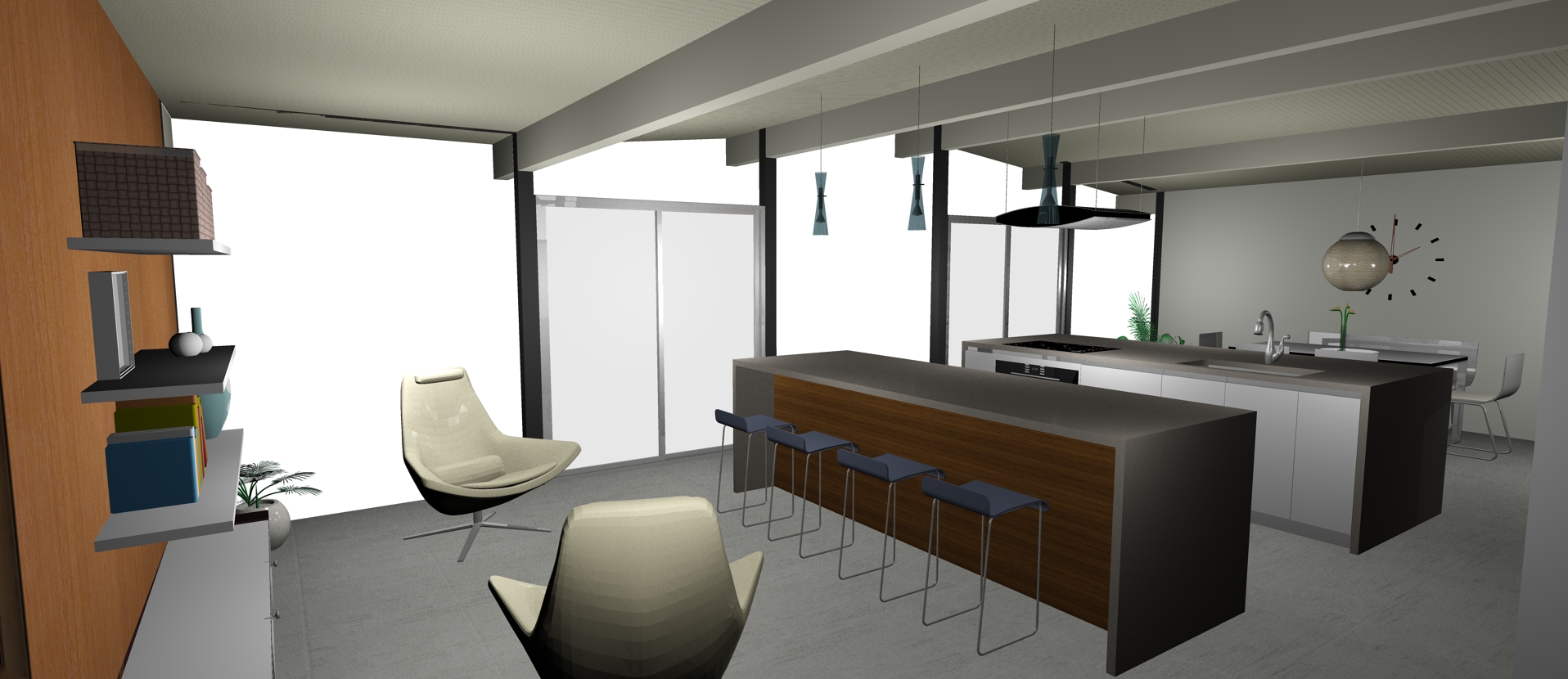
Then in the alcove, a built in Murphy bed, with shelves either side, and above. filling out the rest of the alcove and extending a bit beyond, is a built in seat. The murphy bed folds down over this seat:

Murphy Bed Up

Murphy Bed Down
One more view, with pool table marked out for size too:
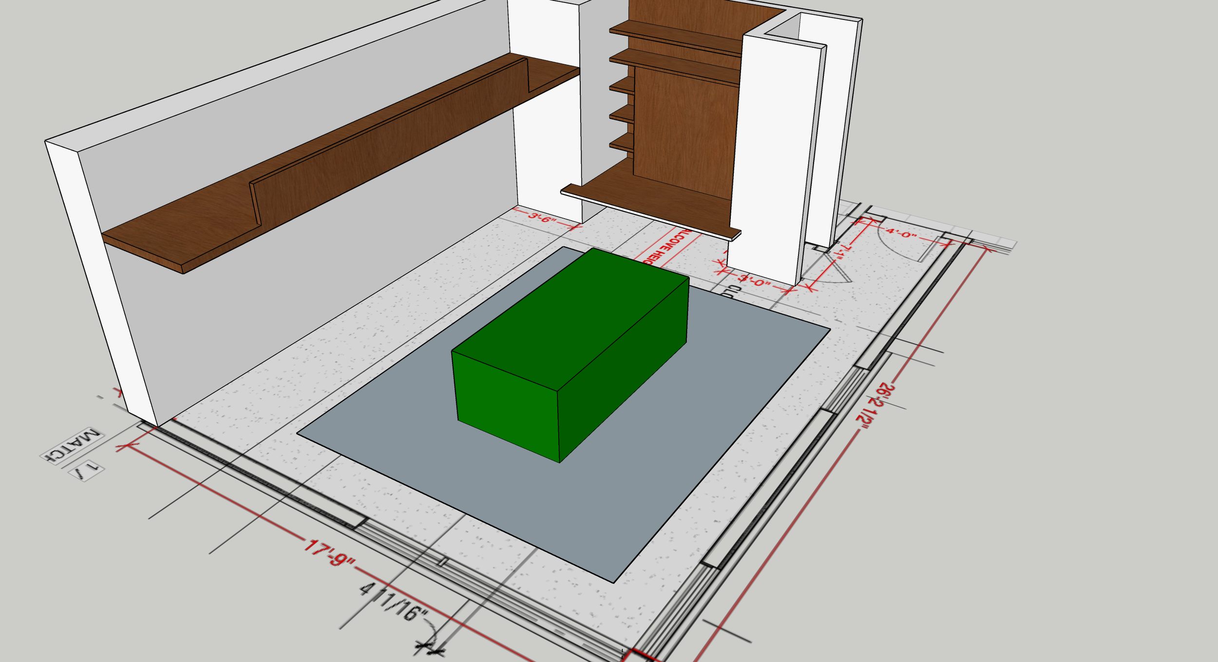
Pool table is marked in green, ideal cueing area is in blue
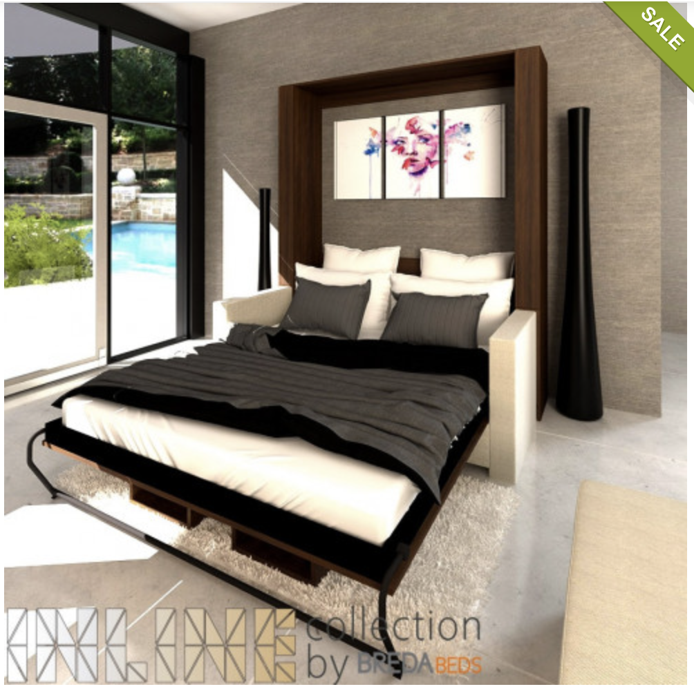
Some inspiration images I took this from...
Murphy bed folding down over a couch (click to scroll through three images):


But imaging it coming down over more of a built in seating bench instead of couch, like this.
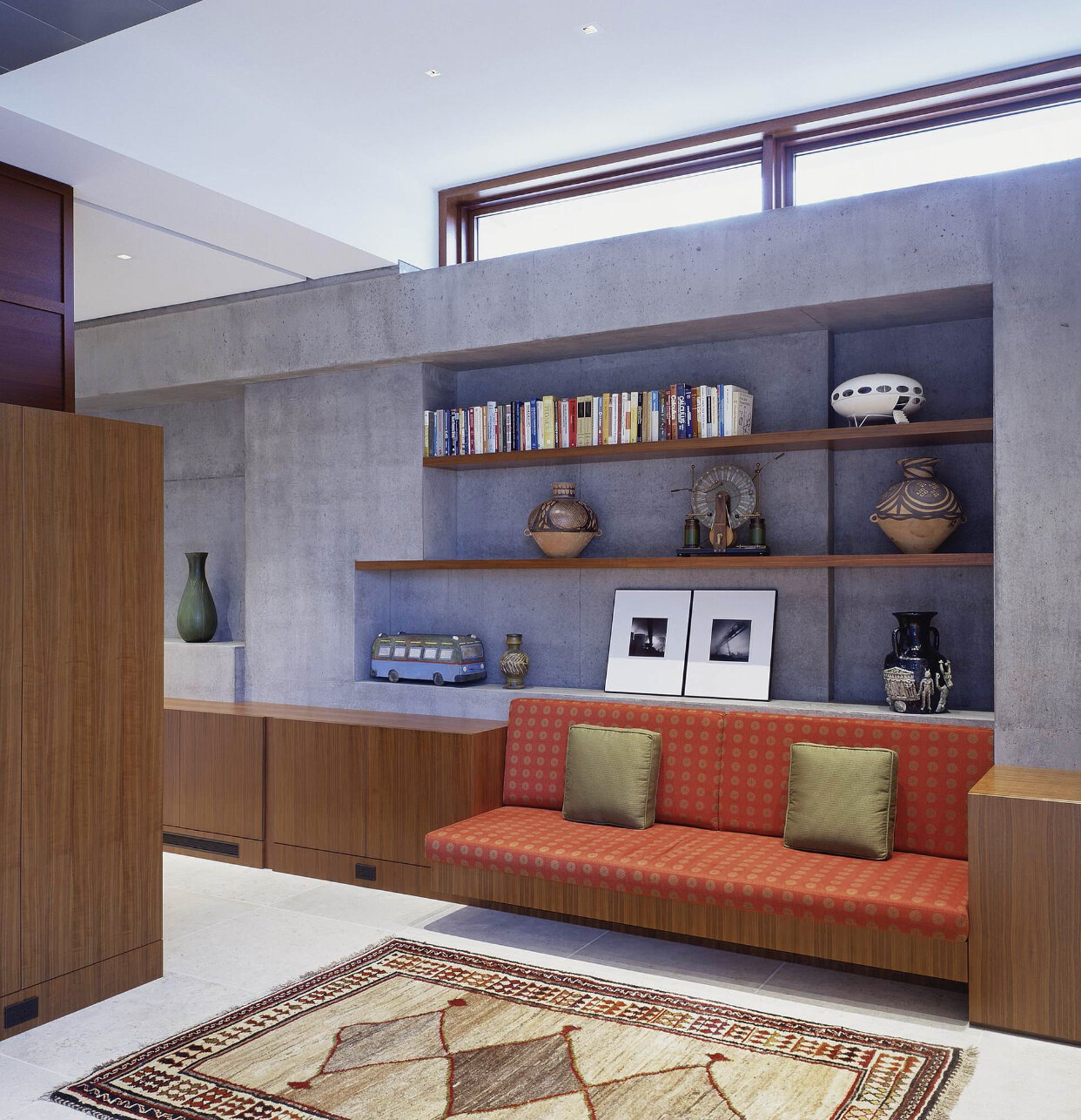
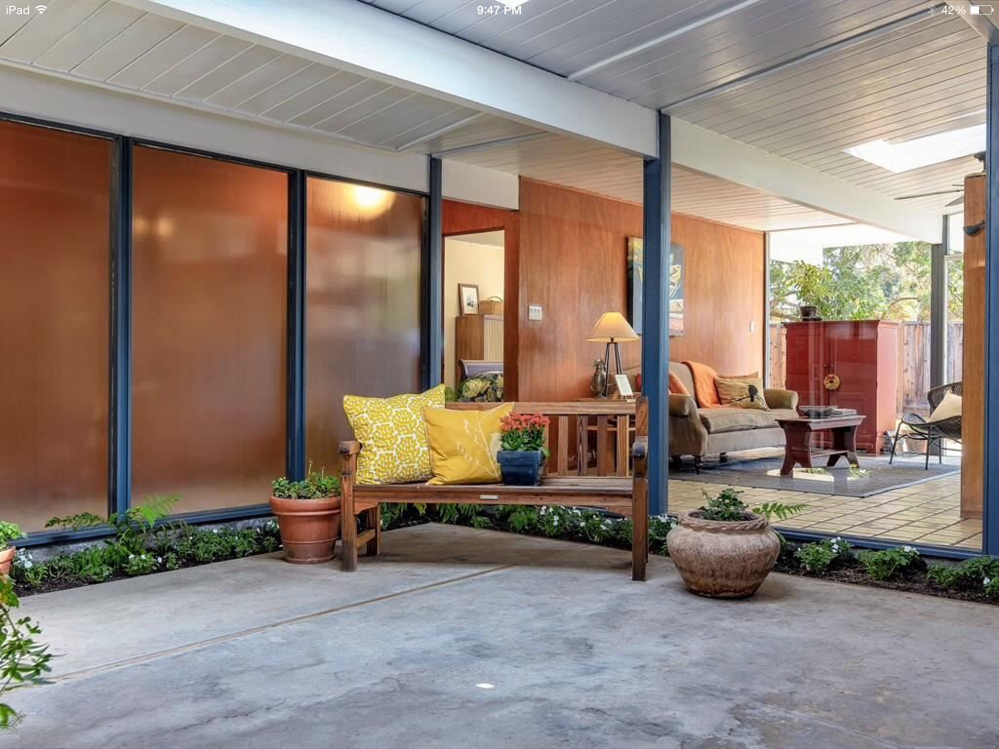
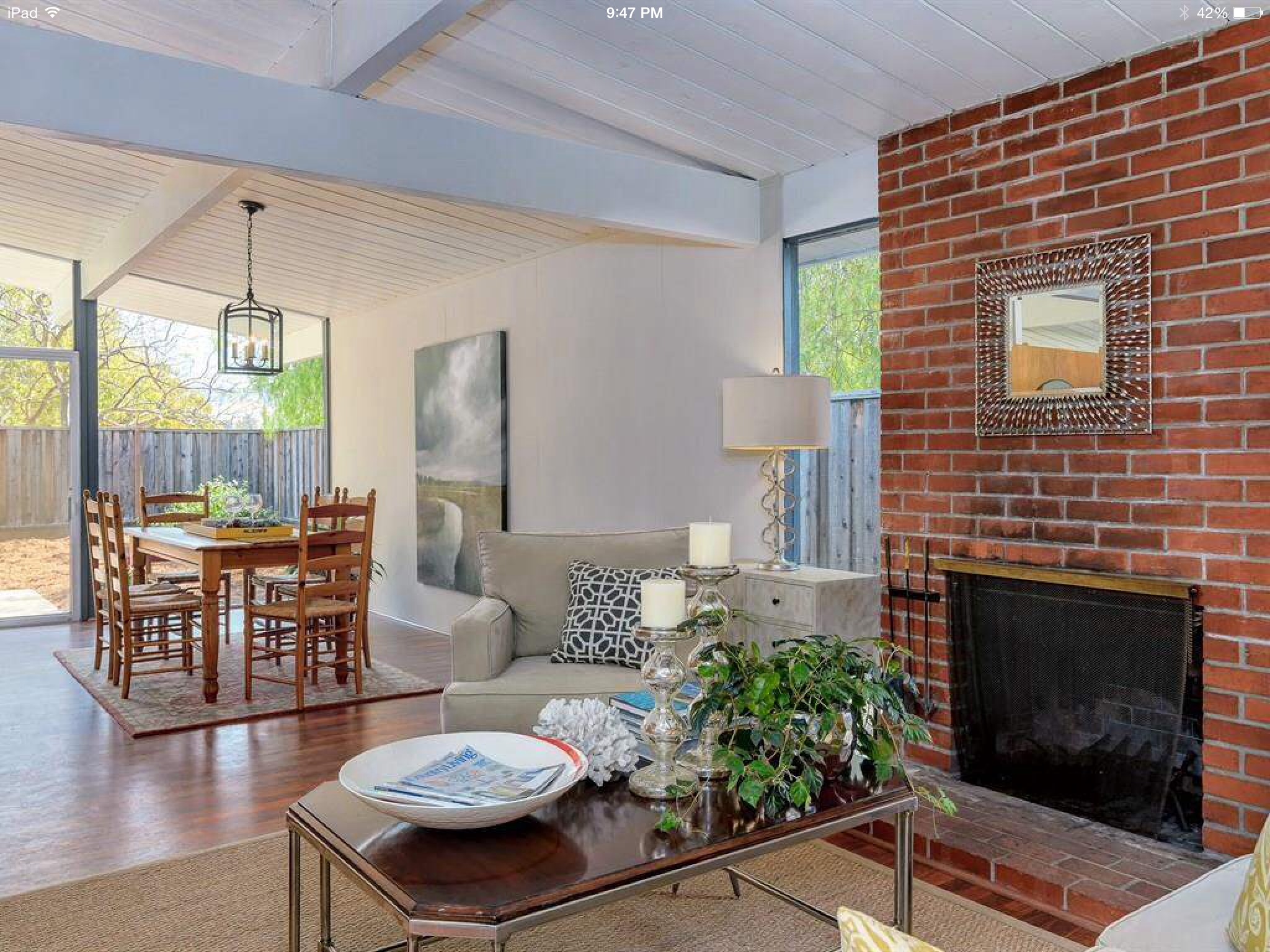
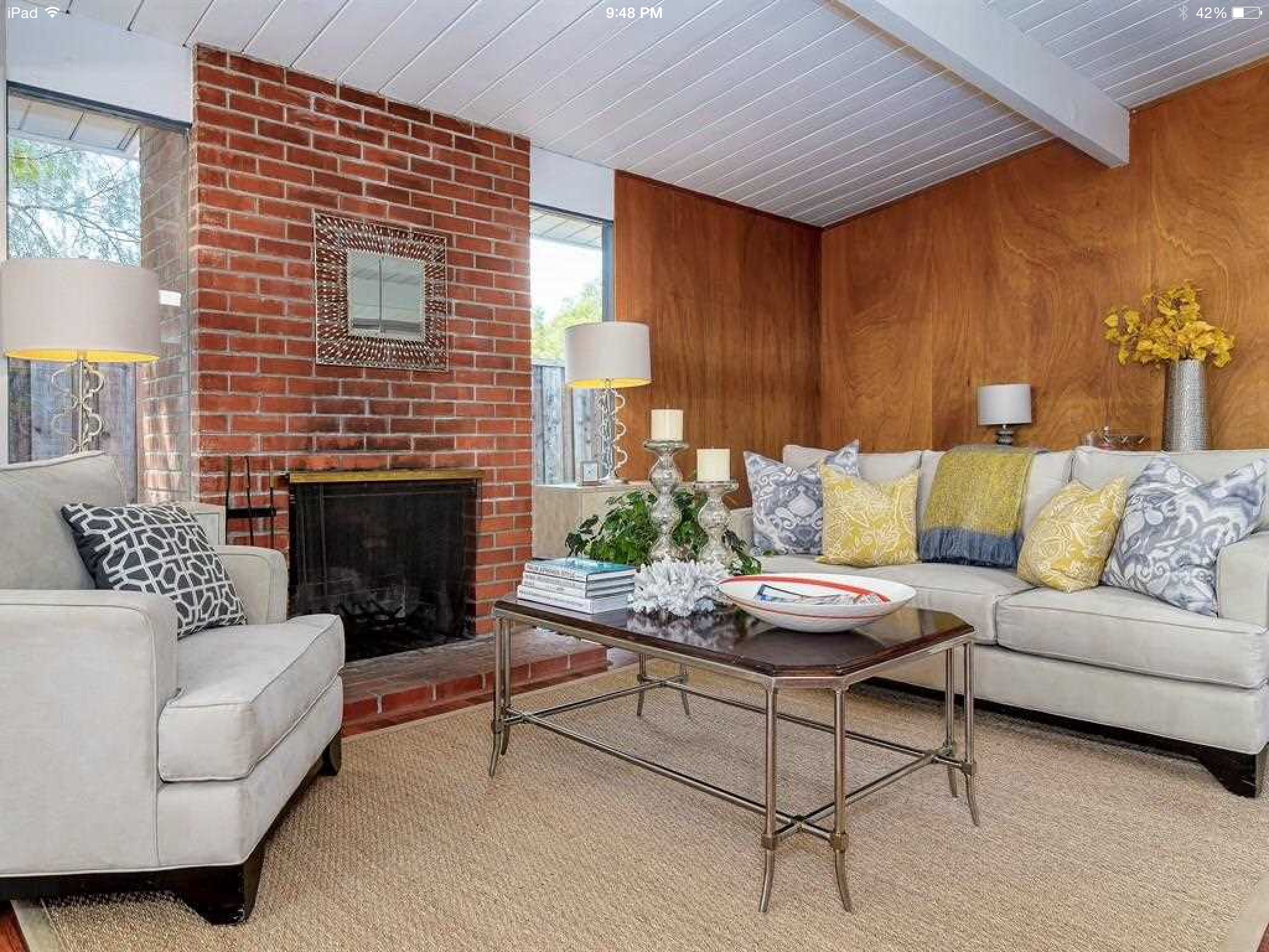
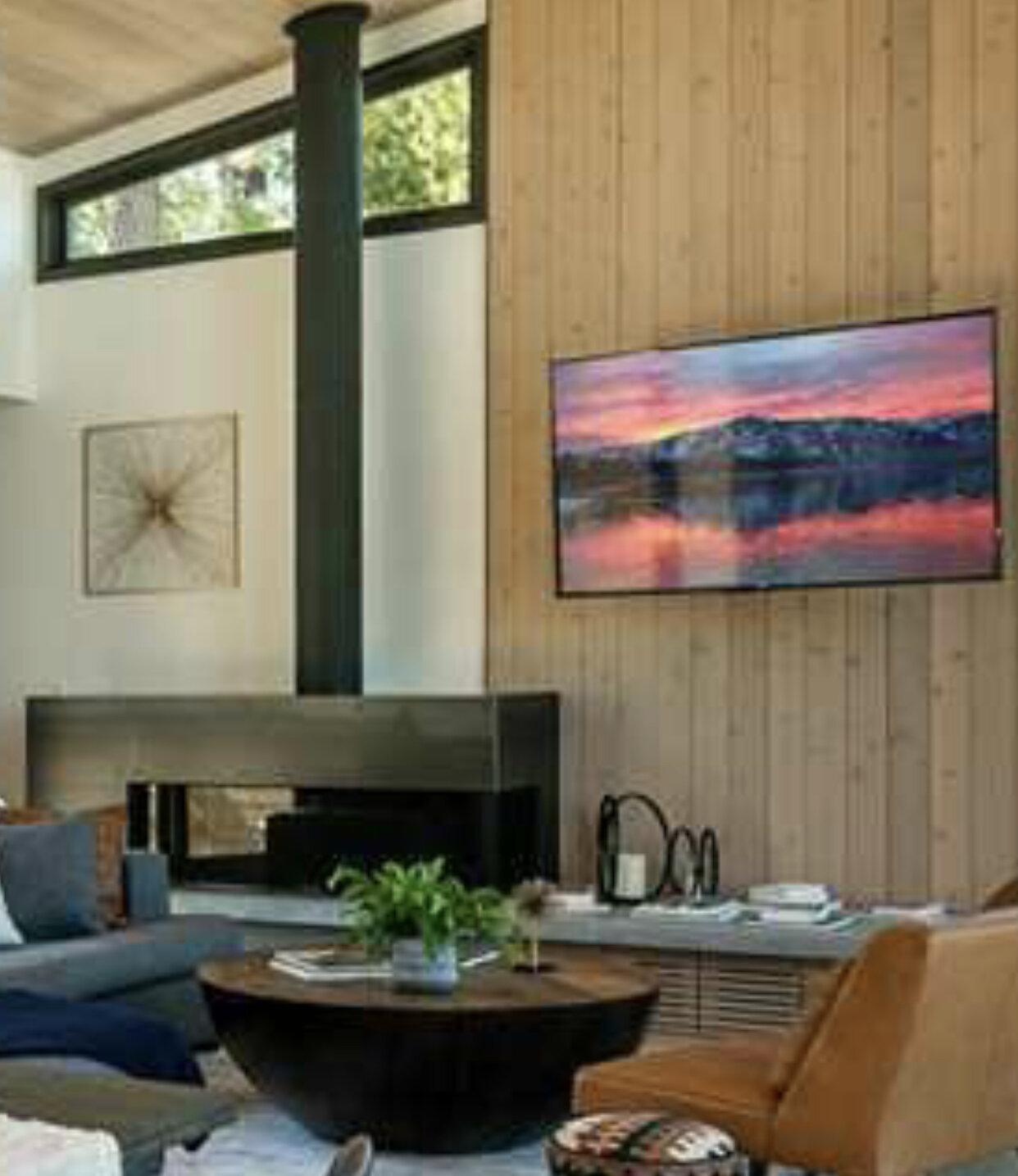
Or maybe even done to match the seat around the fireplace in great room.
Either way, it would be useful to have storage integrated underneath. There will be a bunch of bedding to stash somewhere in this room.
And, to add a bit more complexity… I'd want power on each side of the murphy bed...and in the bunk loft...:)
Al